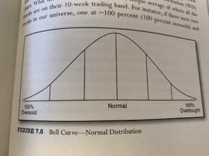
Another look at the Sector Bell Curve.
The bell curves in this post are all the different market sectors, stacked on top of each other. In other bell curves we can stack by individual sector member names or by indices. Thanks to our friends at Nasdaq Dorsey Wright, we can also examine markets on relative strength, on 10-week or 30-week, on positive trends and also by momentum.
In the examples below are bell curves of the market sectors. They are stacked by how “over-bought” or how “over-sold” their group is. Sectors get stacked toward the left side of the curve when markets become over-sold. A bell curve becomes over-bought when most of the members of the sector bell curve are shifted toward the right side of the curve.
We know from previous posts that over-sold markets provide good opportunities to buy. But over-sold markets can be very frightening. No one wants to look foolish buying, only to see their investments trend lower. We also know that over-bought markets are markets needing a breather, or a pause. Over-bought markets can pull back toward the middle of the bell curve.
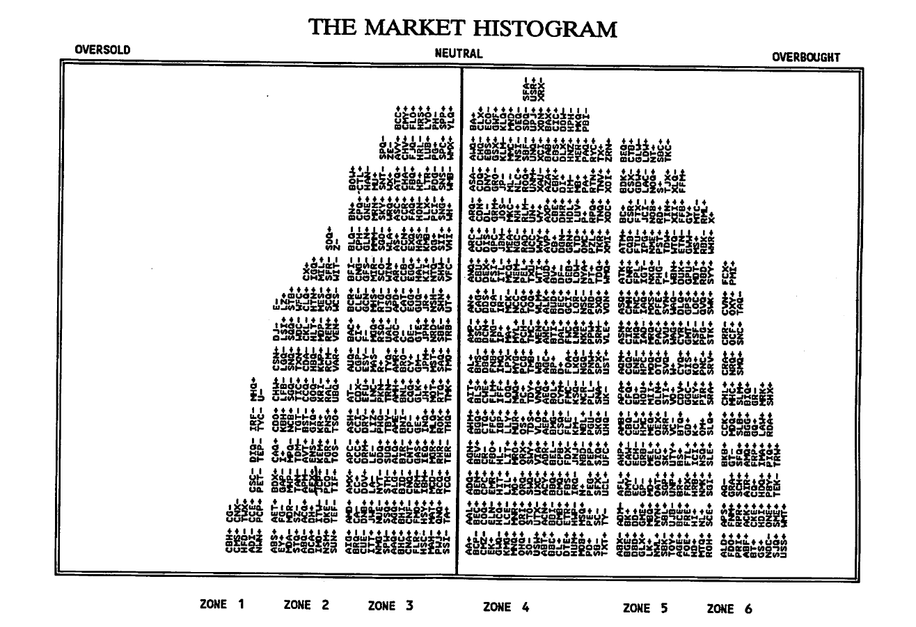
In the previous post, we showed how DYR Associates (and Jim Yates) constructed a “market histogram.” That is, Yates plotted on a bell curve all the 500 stocks that comprise the S&P 500 index. The example shared was from August 1991. As markets change from day to day, the bell curve shifts around.
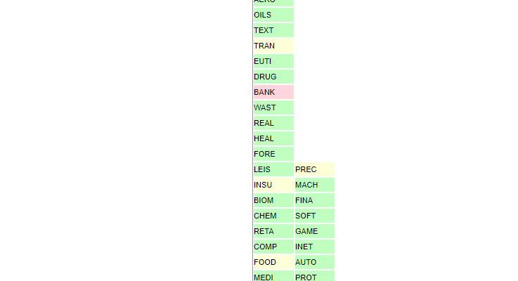
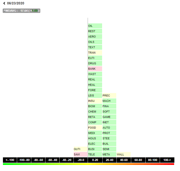
In the examples nearby, we show the sector bell curve. Unlike the Yates illustration of the 500 stocks in the S&P 500, here we show the sectors, not the individual stocks. We can share the S&P 500 stocks on a bell curve. Contact us if you have an interest in seeing that.
At the present time (June 23 2020) most sectors in the “sector bell curve” are sitting close to the center of the curve. The market appears to be fairly normal. It’s not too over-bought or over-sold at the present time.
At the time I am writing this post, the market is down several hundred points. yet, observing the markets using these tools paints a completely different picture, doesn’t it?
What’s helpful for us as investment advisers on the Jersey Shore is knowing from day to day the market may swing around. But until sectors get significantly over-bought or over-sold, you can “let the markets do their thing.”
More than anything, we’ve learned markets will move a lot on a daily basis. But implementing tools like the sector bell curve helps us to develop excruciating patience. Excruciating patience comes in handy when everyone around us seems to be losing their minds.
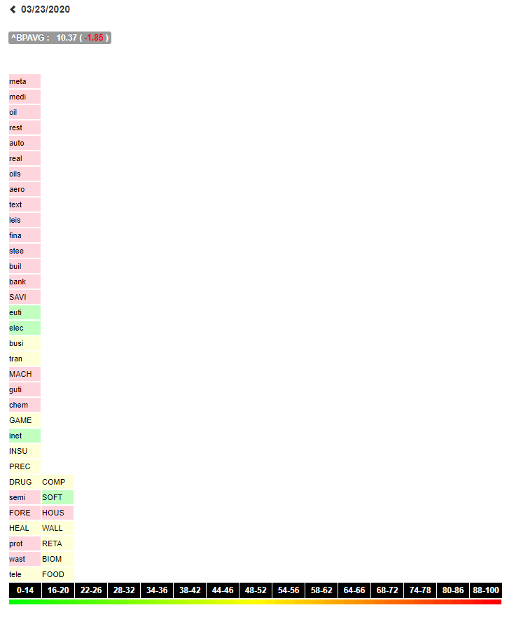
By comparison, here is the very same bell curve on March 23, 2020. Exactly three months ago we were watching markets plunge to levels we could not have predicted. If there was ever a time to keep your wits about you, it was the past three months.
Here all sectors are skewed far to the right. This indicates a very over-sold market. While very frightening, the end of March-early April period provided some good opportunities with the sector bell curve.
In preparing for this post, I examined the bell curves on a daily basis from late March through today. I was searching for an example of a very over-bought sector bell curve. Even with the strength in the market in the second quarter, it was hard to find a bell curve showing extreme over-bought levels.

 The real action was finding those recommended stocks down in zone 1. These were over-sold and unloved. The older brokers at Lehman pointed out you could often pick up some good stocks which had fallen into zone one, and get a nice bounce from them.