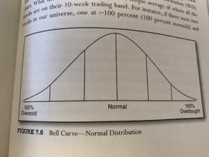
Most of us are familiar with a bell curve, and what that means. These curves often show the “normal distribution” of data.
Around the middle of the curve, where there is a bulge, is where most of the data can be found. The outliers are found at each end of the bell curve, way out to the left and the right.
Without getting too complicated, the further your data strays away from the center of the bell curve can indicate below-average or above-average performers.
The further a point is out on the curve, the more “standard deviations” it’s said to be away from the center. Sometimes, you’ll hear a market commentator exclaim, “that move in the market was FOUR standard deviations from normal.” Just keep in mind when someone proclaims that, they’re usually the ones drawing the lines. So, be a little skeptical, my friends.
I’ll put away my tin-foil hat and keep things simple from here on. Very little talk of “standard deviations.”
Roughly thirty years ago, I was a broker in Chicago. There, at Lehman Brothers, we had a faxed report circulated around the office each week. Jim Yates of DYR Associates published the report.
The way the report was explained to me was brain-dead simple. Forget the stocks in the middle of the bell curve. The stocks in Zone 1 were over-sold. Stocks in Zone 6 were over-bought. Our job was to scan all the symbols in “Zone 1” on Jim’s report.
If Lehman recommended the stock, we buy them. And if we found stocks we owned that moved all the way to the far right, into “Zone 6,” we were to sell them. It didn’t matter the price of the stock.
Nearby, you’ll find a photo of a bell curve from Tom Dorsey’s book on point and figure charting, page 237.
 The real action was finding those recommended stocks down in zone 1. These were over-sold and unloved. The older brokers at Lehman pointed out you could often pick up some good stocks which had fallen into zone one, and get a nice bounce from them.
I loved the simplicity of that. And it worked well. I had heard of bell curves, standard deviations and “reversion to the mean” while studying to get my MBA in Finance, but never found practical applications for them.
What Jim Yates did was rename “standard deviation” with the term “zones.” It was so simple, but still elegant. He would then map out the members of the S&P 500 based on their normal distribution, their bell curve.
What Yates (and others) figured out was that many stocks often “revert to the mean.” Yates explained stocks mostly want to “hang around the middle of the curve.” When you can spot a stock you like – sitting way to the left, or way over to the right on the bell curve, you knew what to do.
What I didn’t know was Jim Yates was writing the report for option strategies. Jim knew stocks often revert to the mean, to the middle of the curve. So he used the bell curves and the zones to spot situations where he could buy puts (betting on a decline) for over-bought stocks in Zone 6. He could also buy calls (betting on a price increase) on stocks found in zone one.
I just wanted to buy stocks at a discount. Stocks that had a chance of moving up, since my firm recommended them. We all lived in “zone one” and waited for that fax to come through the machine every week.
After moving to the Jersey Shore in 1992, I had friends read off names from zone one “bounce” candidates. That was all that mattered to me.
Fast forward a few years. I’m learning more and more about point and figure charting. I’m reading a book written by Tom Dorsey. On page 64, Tom talks about increasing your odds of success, and brings up the name, Jim Yates. I nearly fell out of my chair.
With that link between Jim Yates and Tom Dorsey, I knew I was on the right track. To this day, we still measure over-bought and over-sold stocks, sectors and entire markets – and review them each week at Mullooly Asset Management.
Here’s an example of Jim Yates’ “Market Histogram” from August 5, 1991. Might be a little hard to read, but if you look closely, you will see all the stock symbols making up a bell curve. You can click on it to see a larger image.
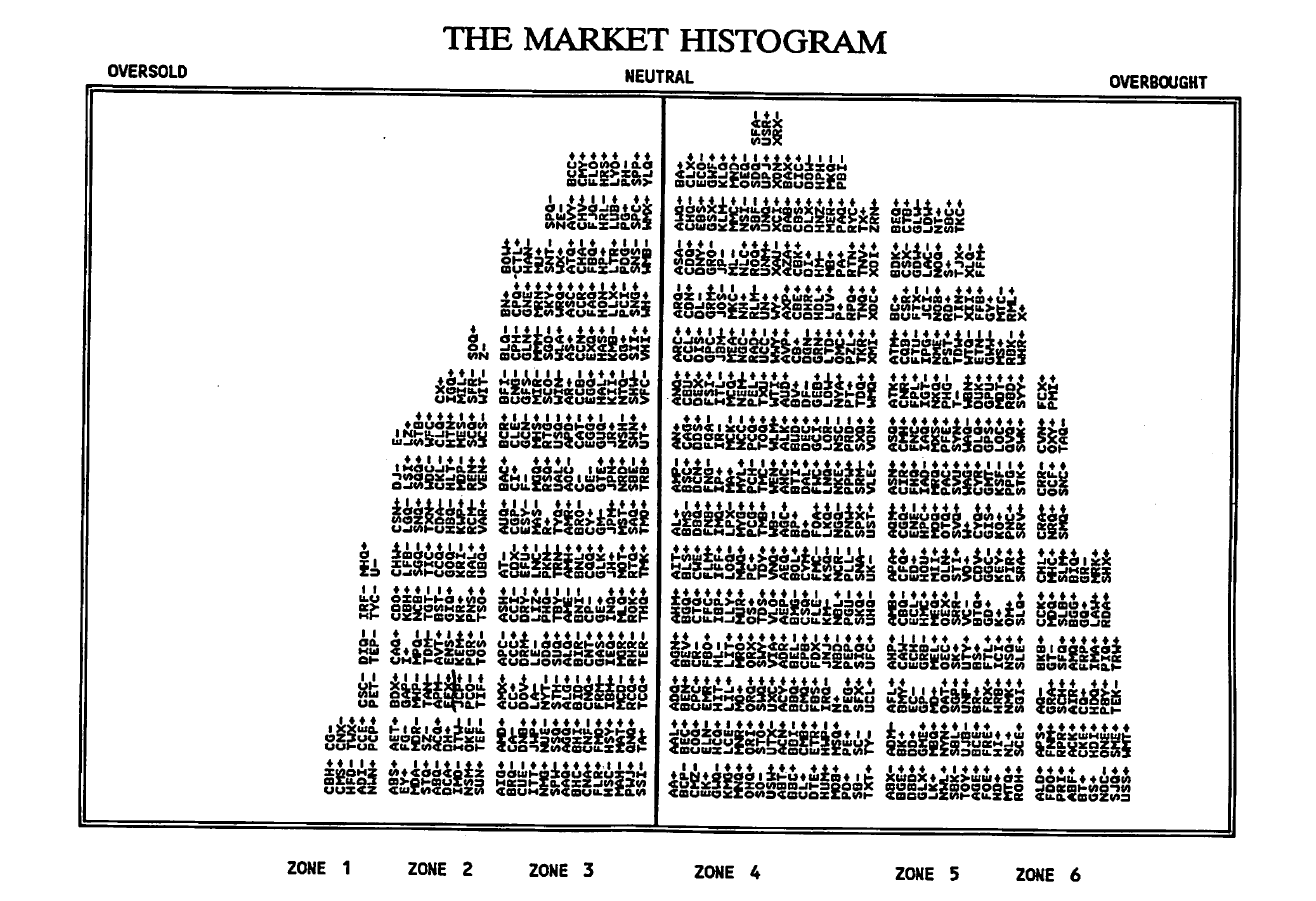
Over to the left, in “Zone One” are the oversold stocks. A lot of these stocks are no longer around, or their symbols have changed over time.
But I see (in Zone One) PCP (Precision Castparts, now owned by Warren Buffett), the utility CMS Energy, TWX (used to be Time Warner), ADI (Analog Devices).
In a future post, I will show how the bell curve itself moves from left to right. It’s becomes a little clearer when you can see stocks, sectors or the entire market over-bought or over-sold.