Getting a grip on the “Jobs” reports.
We recently referred to news, like unemployment statistics as bad. But without a yardstick, it’s difficult to see if we’re making progress. Let’s decipher the jobs data we’ve been seeing the last few months.
Initial Jobless Claims
Every Thursday morning (at 8:30 ET) we get the “initial jobless claims.” This is a report showing us how many people filed for unemployment for the very first time. This is the first filing after losing jobs via furlough, temporary layoffs or permanent layoffs. When the shutdown began in March, and people began losing jobs, the initial jobless claims were enormous.
Through late March and into April, more people lost jobs. The initial jobless claims spiked to more than six million. These initial (first-time) claims have steadily shrunk since then. Throughout May and June we still heard stories of folks around the country, still without jobs. Even right here in Monmouth County, NJ, many had trouble reaching the local unemployment office.
The initial claims continue to stream in, but at a slower pace each week. Data released Thursday August 6th, 2020 showed a decrease in first-time claims from the previous week of 249,000 claims. In total last week 1.2 million initial jobless claims were processed. These remain historically high numbers.
Continuing Claims
Continuing claims have taken on more relevance lately. These numbers are also reported each week, on Thursday morning at 8:30am. Continuing claims are the number of individual remaining on unemployment, still looking for jobs. A little bit of algebra gives us the numbers returning to work. Continuing claims are always two weeks behind. Data reported on August 6th represents continuing claims from the week ending Saturday July 25th.
This week, continuing claims are 16,107,000. This is a drop of 844,000 from the prior week’s report. This can be interpreted as 844,000 people returned to work. This is still a gigantic number of folks not working.
The Unemployment Report
On the first Friday of each month, we get the “unemployment report” from the Department of Labor. This report will give us the overall unemployment rate.
The unemployment rate for June, reported in July was 11.1%.
The unemployment rate for July, reported Friday August 7th, was 10.2%.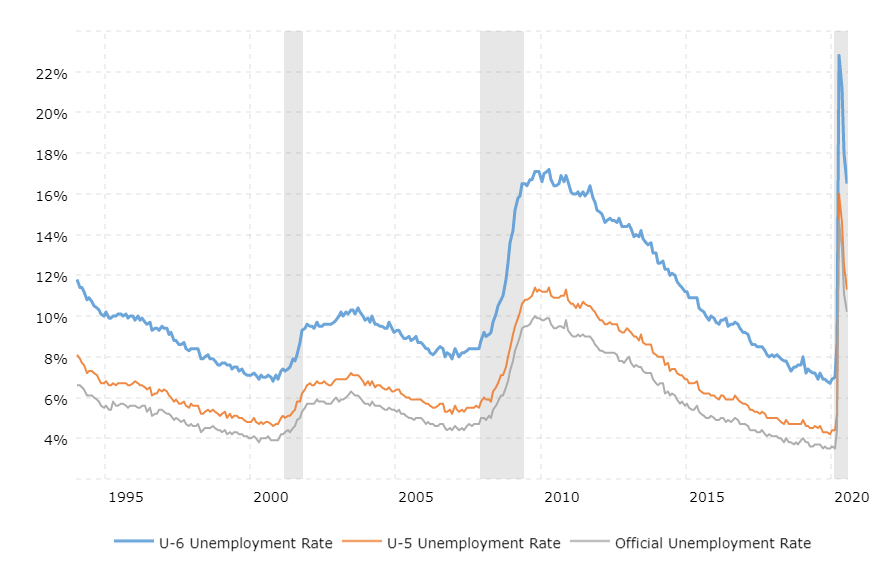
Technically, this “unemployment rate” is called the “U3 report.” That’s important to know because there are other reports examined each month. These include the U5 and U6.
There is one bit of nuance many miss is when we refer to the “unemployment rate.” This report measures the period from mid-month to mid-month, not calendar months. The July unemployment report measures employment data from mid-June to mid-July.
What if there are any significant changes occurring late in a month? That may not be accurately reflected in the current numbers.
More on U3, U5 and U6
Two other data points released on the first Friday each month are the U5 and U6 reports. The chart nearby, courtesy of Macrotrends, displays the U3, U5 and U6 data points, going back to the mid-1990’s. The grey bars represent recessions.
The U5 report also includes discouraged workers and all other marginally affected workers. This number represents people who have stopped looking for jobs, but would like to work.
The U-6 number is the total number of unemployed people without jobs. The U6 report includes individuals working part-time purely for economic reasons. This measures the number of folks working part-time but want to work full-time. The current U-6 reading is 16.5% This is a “depression-size” number. Last month (June 2020), the U-6 number was 18.0%
The Street.com also put together a good primer on unemployment statistics which you can see here.
If you’ve never seen Mel Brooks’ “History of the World, Part I” there is a great scene regarding unemployment and jobs. Bea Arthur (from “Maude”) as always, does her very best deadpan: